Color Correction
Using Color enhance options you may change tile colors and brightness for a better match with the corresponding area of the original image. Sometimes this is the only way to get good looking mosaic, especially when the mosaic was made using a limited count of tiles in the library. Experiment with different combinations of values to get the best results.
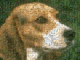
Look at the sample results:
This mosaic was rendered from same collection and was saved with different Color enhance options. See the whole mosaics and their details:
Color
Correction mode:
|
0 %
|
30 %
|
60 %
|
90 %
|
 |
 |
 |
 |
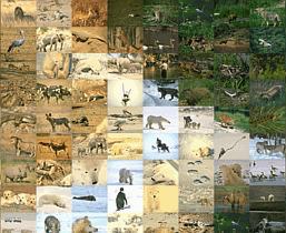
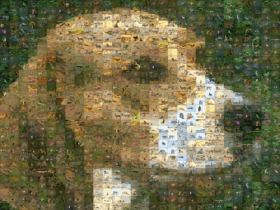
Color Correction 0 % (No color correction):

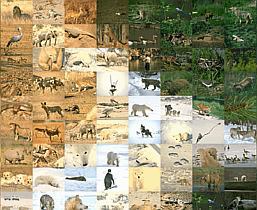
Color
Correction 30 %:
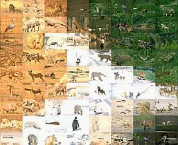
Color
Correction 60 %:

Color
Correction 90 %:


Blending
tiles mode:
|
0 %
|
20 %
|
40 %
|
 |
 |
 |
Blend
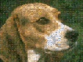
tiles 0 % (No Blending):

Blend
tiles 20 %:

Blend
tiles 40 %:

As
you may see, enhancing by Color Correction is not as obvious as
Blend tile colors, though you may need to use both together to
get the best results. Usually it is quite safe to use Color
Correction up to 50% or even more.
Using of Blend tile color has a more obvious effect. Usually it is very effective whilst still being subtle up to 25% but can be acceptable up to 35 or 40% depending on what type of images you are working with.
Using of Blend tile color has a more obvious effect. Usually it is very effective whilst still being subtle up to 25% but can be acceptable up to 35 or 40% depending on what type of images you are working with.